In the crowded marketplace, your brand is more than just a product or service—it’s a personality that should stand out, not blend in. Designing promotional materials that reflect this personality is key to making memorable connections with your audience. Whether you’re quirky, bold, elegant, or cutting-edge, matching your brand’s identity with the right visuals and messages isn’t just good design—it’s good business. One of the most versatile ways to start is by creating custom flyers that convey exactly who you are.
Let’s Talk “Brandsonality”
Your brand’s personality is like your best friend’s vibe—it makes them recognizable and relatable. So, if your brand were a person, what would they wear? What would they say? A brand’s “voice” should extend beyond the copy on your website. It has to show up visually in the colors, typography, and design elements that adorn your promotional materials.
- Is your brand fun and playful? Use bright colors, funky fonts, and witty copy to convey energy and creativity.
- Sophisticated and minimalist? Clean lines, muted tones, and elegant typography signal professionalism and quality.
Color Your World (and Your Flyers)
Color psychology is your secret weapon. Each hue triggers specific emotions, which means selecting the right palette can subconsciously influence how your audience feels about your brand. Let’s say you run a wellness brand: calm, cool colors like greens and blues can reflect serenity and health. On the other hand, if you’re marketing an extreme sports company, bold, energetic reds or neon colors can convey adrenaline and excitement.
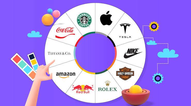
Fun fact: A pop of color can increase brand recognition by 80%. So think of your colors as your brand’s “signature outfit”—one that everyone will recognize from miles away.
Font: Not Just a Pretty Typeface
Typography does more than decorate—it communicates tone. A strong, bold typeface can convey confidence, while a delicate, serif font might suggest elegance or tradition. Mixing fonts can be risky, but when done well, it can express the multifaceted nature of your brand.
You wouldn’t show up to a formal event in sneakers (unless that’s your brand!), so don’t send a mixed message with inconsistent typography. Your fonts should be as cohesive as your brand story. If your logo is playful, your promotional materials shouldn’t scream “corporate monotony.”
Graphics: Show, Don’t Just Tell
The imagery you use is like the facial expressions of your brand’s personality. Stock images can sometimes feel stale or impersonal, so consider investing in custom illustrations or original photography that speak directly to your brand ethos. Visuals should not just fill up space—they should resonate with your target audience.
For instance, a vintage-inspired brand could feature nostalgic, retro-style graphics, while a cutting-edge tech company might lean toward futuristic, sleek designs.
Copy: Punchy or Polished?
Tone matters! Whether your brand is cheeky, inspiring, or straight to the point, your promotional copy should reflect that. But the key is to be consistent. If you’re a luxury brand, be mindful of using refined, premium language. If you’re aiming for a younger, more casual crowd, don’t be afraid to add some humor or playful puns to your message (see what we did there?).
Don’t Forget: The Medium is Part of the Message
While designing promotional materials, think beyond just digital. Physical materials—brochures, posters, business cards, and even packaging—are tactile experiences. High-quality paper, embossing, or even eco-friendly materials can be a subtle but effective way of communicating your brand’s personality.
For example, eco-conscious brands should consider using recycled paper or organic inks, showing their commitment to sustainability even through their promotional items.
Call-to-Action: Speak Their Language
Your promotional materials should encourage engagement, but do it in a way that aligns with your personality. If your brand is bold and daring, don’t just say, “Visit our website.” Instead, try something more punchy like, “Dare to dive in!” Similarly, a more nurturing brand might invite, “Join our community” or “Let’s grow together.”
Final Thoughts: Flaunt Your Flare
Designing promotional materials that match your brand personality is both an art and a strategy. It’s about creating a cohesive experience that not only looks good but feels right for your audience. The more your visuals, tone, and design elements reflect who you are, the more your customers will connect with—and remember—you.
So, the next time you’re crafting your promotional masterpieces, think of it like outfitting your brand in its best personality-matching wardrobe. Because, let’s face it, first impressions matter—and you want to make sure yours is dressed to impress!


